Quotes

Life is short, break the rules. Forgive quickly, kiss slowly. Love truly, laugh uncontrollably and never regret anything that makes you smile. - Samuel Longhorne Clemens (Mark Twain)
Showing posts with label decals. Show all posts

Monday, January 11, 2021

World War II Project - STuG III Decals

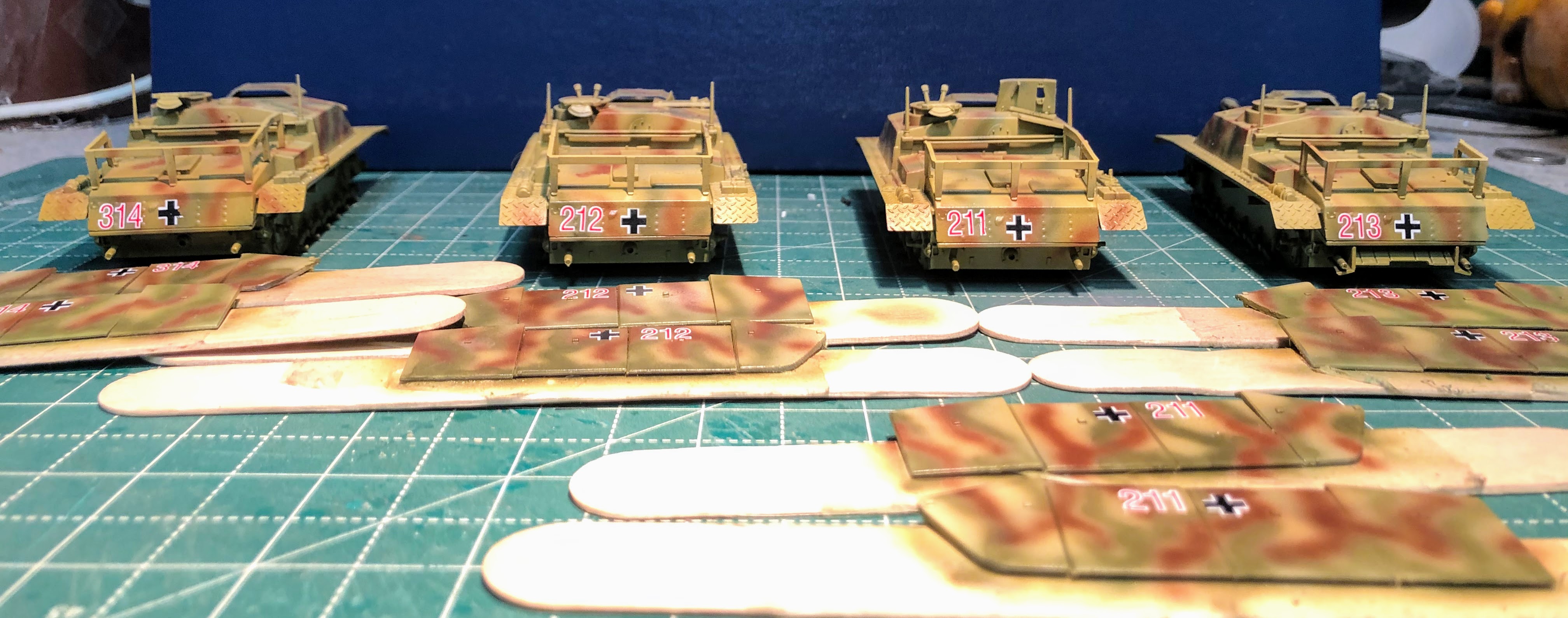
Found a little time to get the decals on the STuGs and the STuH. I used the decals from the Rubicon Jagdpanther kit as those seemed to be a better match for the unit STuG battalion I'm modeling. I ended up having to splice some of the numbers together but I think they came out okay.

I did prep by applying a satin finish to the full body of the STuGs and the skirts. After I had the decals on I hit them up with another layer of the satin finish to seal the decals. I can finally move on to the fun part!



Wednesday, August 27, 2014

Freight Cars for Calamity - Step by Step Weathering - Part 1

I decided that it might be worthwhile to really string together my weathering process into a single post. It will make it easier to reference for everyone that might be interested. For this particular step by step I'll be working with two "new" freight cars for the C&N RY that provides service to Calamity. The first is a boxcar (a goods car for my UK readers) which will be getting D&RGW dry transfers from Clover House. This is another in the series of what I would call fantasy transfers. They use company logos used in publications and advertising but didn't appear on the railroad's freight cars.  Its the same series that I used for the Colorado Central and DSP&P boxcars. The second is a high side gondola that will be getting my home made C&N decals.

I have skipped the first couple of steps which involve dis-assembly, airbrushing the bodies and weathering the trucks. Both of these cars received a coat of Tru-Scale TCP-139 MOPAC Boxcar Red. Probably not the right color for either line but in the end it looks good and will give a little sense of continuity and I can probably get away with it since I'm proto-freelancing anyway.


Step 1 - Time to dull down the bodies and give a little tooth to the next steps. Both bodies and the underframe were given a coat of Testors Dullcote.  The Tru-Scale paint gives a nice glossy finish that you could apply decals to directly but that glossy surface will make step 2 harder than it needs to be.

Here is our starting point. Airbrushed body with a Dullcote finish applied


Step 2 - The Fade. I have used this technique on my modern boxcars but at the time I was using titanium white oil paint and wiping it off, it was kind of a struggle. I read a new article in the Model Railroad Hobbyist (by the guy that originally used the oil paint I believe) that uses acrylic ivory instead so I'm going to give that a try and see how it goes. The idea here is to fade the basic paintwork to make it look like its been out in the elements rather than brand new. I would have liked to have tried this on the CC and DSP&P cars but I wasn't thinking about it at the time. This should give a nice variation in how my trains look on the table. I'm using Ceramcoat Ivory  (#02036) for this, aiming for a paint consistency that's not quite a wash. Here are some in progress shots of this.


Not enough Dullcote on the roof and the paint beaded up. Not really and issue since I then wipe it down with a paper towel.

The roof after the first coat of ivory has been applied and wiped off. I need to be more consistent and always wipe in the same direction. A lot of this will end up hidden by the soot that will be applied to the roof later.

Car side ready to be wiped down

Smoothed out with the paper towel. Since the application was still heavy in a couple of spots I followed up with a brush loaded with water

I added more water to the paint to get this consistency.
I felt like it didn't leave enough paint behind so I did a second application

Looks better, but time to go back in with a brush of water.

You can see it beading up on the roof, that means I didn't get enough dullcote on that surface and its beading up because of the glossiness of the Tru-Scale paint. I followed up the application of the ivory by wiping it down with a paper towel. Its not a bad way to wipe it down and it gave a better effect than using paint brushes. As you  see the effect is vary uneven and I think it looks pretty good. Definitely one of those techniques that you will get better at you do more and more cars. 
The Ivory fade coat

The first wipe off with a paper towel. I felt like there was to much paint left behind so I followed this up with a wet brush to tone it down some more.


Since this is going to serve as our basecoat I gave it another layer of Dullcote to protect it from what is to come.


Step 3A - Which could also be step 2. At this point I'm applying the decals and dry transfers. I forgot just how bright the C&N Logo is and its really standing out at this point. If these had been black decals (yes, I know the D&RGW one has black) I would have definitely applied and sealed the decals and transfers first. I should probably do that anyway. Again I didn't think things through because the freight cars I had done before were all RTR so the everything was in place when I did the fade. This time I'll just have to hope that upcoming weathering steps will dirty everything up enough to blend them in. I'll start with the dry transfers for the boxcar first.


My main "burnishing" tools, a couple of my sculpting tools that have rounded spoon like ends

Here we go! I have already done two cars with these you would think I could get things right. I left the backing on when I started to rub the transfer down.

You can see how the D&RGW letters looked a little chipped because of my mistake. Actually this whole side is a little rougher than I would like. Weathering should hide most of this and damaged paint isn't unusual anyway. The logo is a three part affair. The base is black which you can see above

Lined up the white and rub it down over the black. No registration marks to work from, you do it by eye and you are further handicapped by trying to stare through the paper.

And one more layer of black in place. I managed to miss one of the black lines at the bottom

Repeating the process on the other side. Much better at this point.

And back to the logo

Lined up the white, looking good

But when I put on the second layer of black it pulled up some of the white at the bottom and along the upper edge of the inner circle. Was looking really good to this point. Overall the effect is good.

Sealed and ready for the next step.


Step 3B - Decals. You may or may not have read previous posts about making my own decals, this will be the first car to receive the new decals printed on white decal paper. The gondola provides some additional challenges because the letter has to be broken up to fit between the stakes. This time I get to use my decal set solutions instead of lighter fluid, they should snug down much tighter.


I get somewhat obsessive about research at times, not always, but sometimes. I spent a good portion of this week working on some revisions to the decals. I discovered a new source for pictures and I found some photos that I hadn't seen before. Realizing that what I had wasn't quite right I had to redo some of them. Still calling in some proto-freelancing leeway as these freight cars are a little short or my graphics were a little big so I made a couple of compromises. I changed the placement of the number and left of the RY. from the end of the name. Essentially all the flatcars and gondolas had all of the lettering on the frame rather than on the sides except for the drop bottom ore cars (which I think I found a source for). What it amounts to is that there is only one photo showing off the new decals.


So far I like this paper a lot better and it snugged down quite nicely on their own.
Once the decals had dried I gave both cars another light coat of Dullcote.

I'm going to break this into two pieces at this point so look for Part 2 later this week or early next week.


TCP-139 MOPAC Boxcar Red

Wednesday, August 20, 2014

C&N RY Decals - Part 3

I didn't get quite as far with these tonight as I wanted. The printing itself was pretty successful but I need clear gloss to seal them and all I have is clear flat spray. I'll have to run by the hobby shop on the way home tomorrow and pick some up and seal them. If all goes well I should be able to see if they actually work tomorrow. I figured I would show a little progress though. I'm also thinking about signs I want for buildings in Calamity as well.


Remembered to add the RY. to the end name this time. These are printed on the white decal paper that's why they have a colored border. My printer doesn't have a high a resolution as I would like but I think I can hide the dot pattern with some close trimming and some judicious weathering.

I really like how the logos came out. Can't wait to give these a try. These are also printed on white decal paper.

Monday, August 18, 2014

Decals for the Colorado & Northwestern Railway, Calamity's railroad - Take 2

I have been working on the decals for the C&N off and on for a couple of weeks. The decal paper I ordered has arrived. I have 10 sheets of white and 10 sheets of clear. My intent is to only print on 4x6 pieces so I have some cutting to do and there will be some waste as sheet will only yield 3 pieces of 4x6. However, I think that working on smaller sheets helps me stay focused rather than trying to fill an entire sheet and not really knowing what to put on it. I have stuck to the simpler stuff for the moment; the logos, numbers and letters.

The white backing should make the lighter colors show up better but that requires a background color otherwise I would go crazy trying to cut out individual letters or something ridiculous like that. I have spent a lot of time trying to get a least close to the colors of the freight and passenger cars and I'll let the weathering process blend them together. I did a test run on regular paper and I think the colors are pretty close. I also picked up on a couple of errors laying out the first two sheets, like I left off the RY off the lettering for the passenger cars and I was over optimistic when I thought I could get the car numbers on the same sheet. No problem I have plenty of sheets to work with. I think I'm on the right track though.

The result of a weekend or so of work

Not really going to be able to fit the numbers on this sheet after all

I'm quite pleased with the C&N Logo though.

Wednesday, July 30, 2014

First Decals - Not so Good

I tried out the decals that I made the other day. Overall not a success, I certainly learned a lot during the process. First trying to fill up 8 1/2" x 11" sheets was definitely not a bright move. I could have used a single sheet for the test instead of trying to go whole hog right out of the gate. So here is what I would do I differently:
1) Cut the decal paper down to 4"x6" sheets, photograph size. Plenty of room to print everything I needed to experiment instead of wasting a whole sheet.
2) Double check everything. While the logos look good the smaller versions ended up being elliptical rather than circular. It took me a bit to figure out why the looked a little funny.
3) Cut everything as close as you can to the edge. There is to much decal on the big Switzerland Trail logo.

I'm not sure I like this decal paper. Its suppose to snug down with lighter fluid but I wasn't really seeing that despite multiple applications of the lighter fluid. I was using Zippo, but maybe another brand would work better. The white definitely disappears when you put canola oil over it as stated in the instructions, but then you have oil on the car. Wiping it off seemed to work just fine, but it needs to be the very last step you do or it will start showing up white again.

The yellow lettering is to light and just disappears against the green car side so I'm not sure what to do about that. Other than being a bit elliptical the C&N logo actually looks pretty good. I think I'm going to look into how to work with white decal paper, but I don't want to have to apply individual letters and numbers to the car sides, that will take forever.
\So on to the pictures!

The Boxcar, not bad, but I need to do a lot better on the trimming and the color is to light. I need to darken it up so its a closer match to the car side's. Logo looks pretty good here.

The Coach car before the decals

The first decals have been applied, they definitely dry very white.

You can just make out the decals in place on the upper sill above the windows. I applied the canola oil and the white faded away.

And with the the logo applied. The logo looks good, but there is something wrong there. Oh, its not circular! Oops.
Now I just have to figure out how to do this better.

Monday, July 28, 2014

Decals for the Colorado & Northwestern Railway, Calamity's railroad

I had so much fun weathering the D&RGW cars that I have been itching to get to the rest of the freight and passenger cars for my Colorado & Northwestern Railway. This time though I wanted to have the decals done before I started the weathering process (I'll have to go back and apply decals to the tank car and do a little extra work there). After checking out the options for custom decals I decided that I would be better off trying to do my own. Totally new experience for me. First I was going to need a lot of white numbers and letters. Without access to one of the famous ALPS printers I can't print white. Somewhere I read about a brand of decal paper that might do the trick (and yes I am aware that there are decals papers that are white instead of clear). This paper is from Evan Designs specifically designed for Inkjets and doesn't not require a fixative spray afterwards. So five sheets, $20 bucks not inexpensive but I ordered it and it arrived a few days later, quite a bit faster than I expected it to.

To work on the graphics I downloaded a free program called Inkscape. The learning curve wasn't bad and there are plenty of tutorials out there if you get stuck. Nice piece of software. There were a couple of miss steps but I managed to get things to come together. I also bought some railroad fonts from Ribbon Rail Productions that would at least be close to what the C&N used. Searching for fonts that were close was the most frustrating part. Railroads just didn't use standard fonts and modern fonts don't look right. Ribbon Rail helped a lot, while I didn't get perfect matches I got pretty close which is all I really could hope for. 

So I'm humming right along laying out lettering and numbers and recreating the logos when I realized that all the white numbers and letters still need a colored border. Arrgh, there goes an hour or so of work. Now I need to paint the freight cars and then scan the color to create a background for the white letters that will, hopefully, be close enough to the actual paint color to be easy to blend in during the weathering process.

I talked with Darel over at C&Sn3 and he recommended Rock Island Maroon from Tru-Scale Paint (TCP-260) as a good match for the C&N boxcar over at the Colorado Railroad Museum. A trip to Caboose Hobbies to obtain some paint only to discover that they didn't have the newest colors yet and the Rock Island Maroon is like brand new this year (actually I think Caboose hasn't been keeping up with the paint, the rack was kind of bare). I decided on MOPAC Boxcar Red (TCP-139). It ended up being a good choice and I'm pretty pleased with it. You can see how it looks in tomorrow's post.

So after maybe 10 hours of research, work and learning some new software I managed to create three, count them three, sheets of decals. I comfortable with the process though so making more should be easy enough.


Checking out the colors on the logos. The logo on the left has a "gold" rim, hard to see in this photo, and the central peak goes all the way to the top of the square. This is for the locomotive tenders. The smaller logo doesn't have the "gold" rim and the peak only goes up about 2/3rds of the way to the top. This is one is used on freight and passenger cars.

A test print of the yellow lettering that will go on the passenger, baggage and observation cars along with the yellow numbers. The black numbers are pretty much worthless, since they need to be in white! This was the point I realized that I really needed to get some painting done.

A test sheet on regular paper. Not bad just need to move it a bit to the right.

Three sheets of decals; logos in three different sizes, a sheet of letters and numbers and a sheet of car data and logos. The Switzerland Trail lettering is not prototypical. I wanted to add some interest to the car sides which are largely blank. Although the Colorado & Northwestern was pretty small as far as railroads its actually fairly well documented. The Switzerland Trail of America by Forrest Crossen is my main reference ( I have several copies) and this title appears on the cover of the book, so I scanned it in to put on the car sides. 
So there you have it, decals from your inkjet printer. Hopefully I get some time to try them out this week.

Sunday, March 24, 2013

Making Signs

I was reading through the blogs I follow this morning and I came across a way to make "decal" signs. Now these are not decals in the way I normally think of them but it is a method of making your inkjet printer do the work for you. Here is a link back to Dave Frary's blog where he described his thoughts on the process along with a few photos of "decals" he had made using it: Trackside Scenary. You should definitely read his comments, the link to the youtube video is there as well, but I'll post it here as a well: Transfer Inkjet Ink on to Wood. I think I'm going to give this a try. I have been playing around with how to add the painted signs that are so prevalent in the west to the building fronts in Calamity. The process doesn't look particularly difficult but it definitely requires some precision when putting the "decal" down in the right spot the first time.
Laser engraved and cut signs like this one are available from most of the manufacturers that make western kits. But there is a large variety of other signs that I would like to reproduce that would have been painted directly on the false front. This technique might work for making those types of signs.