Quotes

Life is short, break the rules. Forgive quickly, kiss slowly. Love truly, laugh uncontrollably and never regret anything that makes you smile. - Samuel Longhorne Clemens (Mark Twain)
Showing posts with label HO Scale Painting. Show all posts

Wednesday, November 8, 2023

Painting the Modelu HO Scale Transitional Era Crew Bundle - Part 8 Finishing Up

Time to wrap this up. These are relatively simple figures from a painting perspective. After the overalls, jackets and caps its just down to gloves, boots and touching up the skin a bit.

To start off I wanted to try something to try and bring out the features on the skin a bit more. I took some Army Painter Strong Tone and thinned it down about 50:50 with their glazing thinner. I painted all of the skin and the shirt with this mix and let it dry. It feels like it added quite a bit of depth to the face and filled in the eyes better than my initial effort, however, my highest highlight was really emphasized and looked very odd at this point. Didn't work as I had hoped on the shirt though, I think the detail is just to fine there to really take advantage of this technique. It also dried pretty glossy, but I expected that.


I went in with my mid-tone skin color. Ammo's Burnt Sand (A.MIG-0133), touched up the skin a bit which covered most of the gloss and tightened up the transition to that highest highlight.

From there I moved on to the gloves and boots, following pretty much the same process as the jackets and overalls; a dark, a mid-tone and a highlight. These areas are small and don't need those transitional 50:50 mixes that I used on the larger areas. I went with brown for the boots and dark grey for the gloves. I'm not quite sure what would have been a common color for railroad workers' gloves in the 50's so I went neutral.


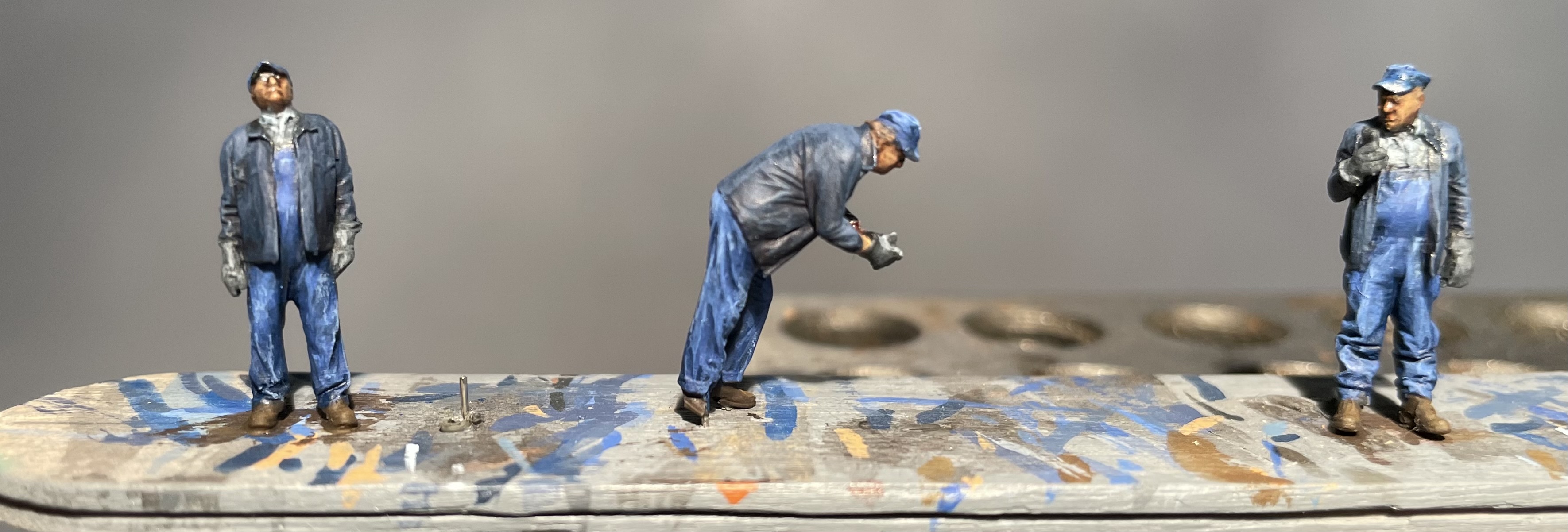


Next its time to add some "nature" (a phrase we use when our Great Pyr brings in an assortment of leaves and twigs on her coat into the house). For me these will be diesel crews for warehouse row served by the Rio Grande. On to the dirt. I used two colors from my Pan Pastel stash, one dark and one light.


Since it is powder I might continue to play around with this, but for now I’ll call them done.

Tuesday, November 7, 2023

Painting the Modelu HO Scale Transitional Era Crew Bundle - Part 7 The Blues - Jackets

Now its time to lighten up the jackets. I'm using some colors that I was trying to avoid because they are part of Reaper's HD series which is not out of production. However, they look like they are going to work pretty well so I'll work with them now and then figure out some replacements.

The first color up is Solid Blue (29816). Its dark enough that I didn't bother to mix it with the Nightmare Black (9280). Its a good step up without needing an intermediate layer of the two colors mixed together.
I followed that up with Solid Blue mixed 50:50 with Nightsky Blue (29818). Trying to limit it to the higher areas now, leaving the two deeper blues in the folds creases.

Next up is then just a layer of Nightsky Blue. I failed to mention that I have been thinning all of these colors with water (since I'm not doing a wash or a glaze at this point). I just want the paint to flow off the brush and if it takes a couple of passes to get the color intensity I want that's just fine.

Final color is Winter Blue (29817). Again with the colors so close I skipped the intermediate mix and went straight from Nighsky Blue to Winter Blue for the final highlight. And of course that ended up being to big a transition so I glazed it back a bit and did a 50:50 mix then followed it up with Winter blue.

I think the jackets are looking pretty good. I like the contrast between the dark blue of the jacket and the more faded blue of the overalls.


Thursday, November 2, 2023

Painting the Modelu HO Scale Transitional Era Crew Bundle - Part 6 The Blues - Jackets

For some reason I thought the jacket colors might be different but it seems like the only color photos I find have everything in blue denim. So more blue. the tricky part here becomes the need establish and maintain a blue jacket that is going to be a different blue from the overalls and cap.

To start things I off I went with Reaper's Nightmare Black (9280) which really seems to be very deep, dark blue. Now I need to tone it down with a different selection of blues than I used for the overalls and I think I want to lean towards a darker end result, the overalls ended up being a bit more "faded" than I was anticipating. Sometimes this is just a learn as you go process.

Its pretty dark but I like the contrast


Tuesday, October 31, 2023

Painting the Modelu HO Scale Transitional Era Crew Bundle - Part 5 The Blues - Overalls

Rather than post each successive layer I figured it would be better to just show the finished product.
Let's start the beginning though, and some of this is probably excessive, I pulled three blues from Reaper to work on these overalls. I'm keeping these all at the same level of "wear" just because I want to keep things simple. If I do another batch I'll try some fading.

Reaper Ezren Blue (89528), Ultramarine (9188), Ultramarine Highlight (9189) and Moonstone Blue (9317)

I started off with the Ezren Blue in the last post but I had to go back and paint the caps so it was one step back to catch that little detail.

Next was a 
50/50 mix of Ezren Blue and Ultramarine. I thinned this down a bit and covered most of the overalls and caps with this, trying to keep the Ezren visible in the darkest areas of shadow.

I followed that with Ultramarine with just a hint of the previous mix in it. I try to keep working the brush in in downward direction as I go. In theory, this should keep this base color away from our shadows. This is the midtone the base color for the overalls.

Working our way up is a 50/50 mix of Ultramarine and Ultramarine Highlight with just a hint of Ezren blue added. Again, I went from top to bottom concentrating on just the higher areas of the clothing at this point. I managed to get a little enthusiastic with this and went a bit deep. I made a glaze of the Ezren Blue and toned down this highlight. It also helped to deepen the shadows and basically pull all the colors back together. I repeated this highlight and didn't get quite so enthusiastic with it this time.

I followed this up with Ultramarine Highlight with a bit of the previous mix in it and just kept hitting the highpoints. I thought this would be the final but things were still looking a little dark so it was off to one more color.

I had Moonstone Blue nearby from doing the study in blue so I mixed it the the Ultramarine Blue for one last highlight using it on the highest points. 

They look a little rough but its time to move on I think.


At this point I'm finding the details on these miniatures to be a bit to fine. While I'm not a huge fan of exaggeration there is a point when exaggeration is absolutely necessary. While the folds in the clothing is excellent, any other "softer", "smaller" details are lost at this scale. In particularly all the definition in the face has been lost. A sculptor would be able to exaggerate facial features to give the face depth and character. Difficult at this scale but I have seen sculptors do some amazing things at this scale (I have also seen some abysmal failures).

Friday, October 27, 2023

Painting the Modelu HO Scale Transitional Era Crew Bundle - Part 4 The Blues

Carol Highsmith photo from the Library of Congress

Sometimes you just come to a crossroads and you need to stop over thinking things and get some paint on the models. I picked Reaper Heather Blue (9231) for the base color on the shirt and Reaper Ezren Blue (89528).

I thinned them just a little bit and went to work. Pretty pleased with the result, the Ezren Blue dried a little darker than it was looking. Looks like a reasonable shade for newer denim. The Heather Blue isn't a bad start for a blue shirt color. I want to try a wash at this point, put haven't quite decided what color to use yet.


Thursday, October 26, 2023

Painting the Modelu HO Scale Transitional Era Crew Bundle - Part 3

A study in blue. I'm trying to figure out the next set of colors for the transition era clue and without a doubt blue is the color to use. Between shirts, jeans and overalls it all just screams to be some shade of blue.

I grabbed a bunch of Reaper paints and decided that the easiest way to figure it was to do some swatches. Here is what I came up with.


After all that, I'm still not sure what I'm going to use. I guess I'll study it for a bit.


Monday, June 5, 2023

A Brick Building from the Ground Up - Part 11

We were on a stay vacation last week getting our yard all cleaned up and ready for summer activities (that is if it ever stops raining around here). So I did very little on the modeling front, except managing to finish the weathering on the DV Ross building.

This was done with a combination of oils, in the form of Ammo's Oilbrushers (primarily Starship Bay Sludge [more brown] and Starship Filth [more gray]) and Pan Pastel Chalks (at this point exclusively Raw Umber Shade). The Oilbrushers went on first providing the darker streaks and lining. After they had dried I went back with a soft brush  and added the Raw Umber Shade. I also applied the Raw Umber Shade to the roof and air vent on top of the building and, generally, any place where I wanted to dirty things up a bit. Another area where I went heavier with the Raw Umber Shade was in the zone where the building sides and stairs met the concrete. It may have gotten a little heavy in a couple of spots but overall I think it came out pretty good, it also helped blend some of those colors and edges together that I had already painted the concrete with.

At this point I'm calling the series done. It certainly could use some other things to dress it up but that will likely have to wait for a while. Things like:

1) Brick liner for the interior roof edges. I bought some printed brick paper that claimed to be HO Scale but was in fact much closer to S and far to large for my purposes.

2) Roof clutter. There really needs to be a lot more going on the roof than that single air vent up there.

3) Fire Escape. either on the side or even on the front, it would add a lot of character.

4) Advertising. Its a brick building with a fair amount of blank space which certainly could use a little dressing up. Since this is a practice piece this is definitely a future project for this kit.

5) Graffiti. Not a huge fan of graffiti but from an artistic standpoint it is a challenge and at least in a small amount would help break up all that brick and stone work.

6) External details. Things like a light over the backdoor, a dumpster and other similar details would bring some life to it. I'll just have to keep my eye out for the appropriate parts.

7) Internal walls. Just to break up the see through effect and maybe see if I can go back and add some glazing to the windows. The roof is not attached so its still possible. I might even be able to go back and add some lighting effects of I felt really motivated about it.

There were definitely some pros and cons to the way I went about working on this. I have to remind myself that this wasn't a complete kit. It was a shallow background structure that I added two side kits and one back kit to. The instructions are okay but I can't really judge them based on what I was actually doing. The components, however, were excellent. Everything fit together the way it should. Some of the pieces, like the security gates and handrails, were pretty delicate so go slow then trying to cut them out.

In the end that building will serve its purpose as a photo backdrop for HO Scale miniatures and vehicles. I may even find away to incorporate it into the Warehouse Row layout.


Tuesday, May 9, 2023

A Brick Building from the Ground Up - Part 8

I was getting ready to break out the oil paints to start weathering the DV Ross building when I realized that I needed to cut the curb down for the loading dock. I used a knife and a file to get it close enough. Of course that ruined all the paint work. I re-primed this area and then went over it with the Vallejo Highlight US Tckr. Now it just needs to cure thoroughly before I start smearing oil paint over everything.


A high level look at the curb cut.

A slightly lower level look, just to show how far down I cut it.

Primed and ready for paint.


Monday, March 6, 2023

A Brick Building from the Ground Up - Part 3

More progress on the building and miniatures are staring at me accusingly. I have made a start on the skin tones and picking out anything I missed. Not enough to show you at this point and, of course, I have a couple of other projects in the wood shop going on that are sucking up time. There has been on going research on the first building that I hope to make drawings of for the D&RGW switching layout.

On the ITLA buildings I figured out that I need to cut out the sills first, then install the window or door from so that its flush with the back (inside) side of the building. I was definitely happy that I painted everything before I started assembly on this one, especially that brick work. You might notice that I have repainted two of the bricked up windows with a "blonde" brick color. This color of brick is pretty common in the Denver area. The Morey Mercantile building which will anchor the left side of the layout is built from this brick, at least on the visible sides.

One of the things that I have picked out for these buildings is that just about any face that has a main entrance will be built from bricks that match in color, you won't find visibly darker or lighter colored brick on these faces. The other sides will feature bricks in multiple colors. The color pictures of the south side of the Spratlen-Anderson building really show this off to good effect. That adds another interesting element to most of the buildings that I hope to be modeling.


Everything laid out with the doors and windows in place.

Getting out the clamps and gluing the sides together. One set of my corner clamps is bad so I had to pull out 1-2-3 blocks.

And with a set of clamps missing I had to resort to gluing the remaining corners together one at a time.


Front side

Right side, the windows are towards the front side of the building. I'm thinking this would be a good side for a fire escape.

The back side with the bricked up windows.

Left side, again the windows are towards the front of the building. I'm thinking its a good side for some exterior details of some type.


The next step is to glue the brick "pillars" on the corners and in the middle of each side wall. Hopefully that will soften the contrast between the two side panels.